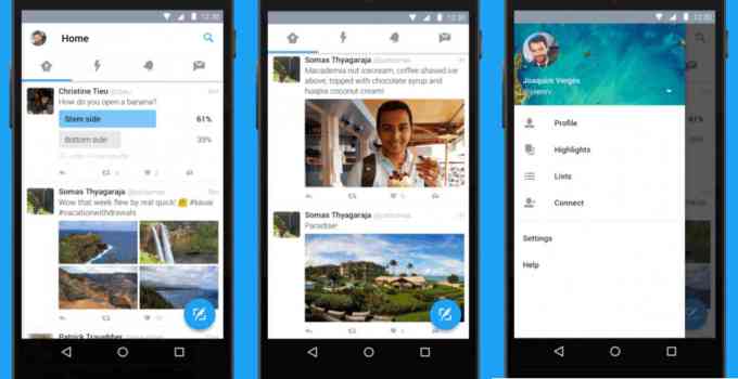
The need for Material design on apps can not be over-emphasized because as it stands, most Tech goons are already taking hold of this awesome feature. First it was WhatsApp Web, then Facebook Messenger App, Instagram App, to mention a few and now Twitter have decided to follow the list of goons rocking the material design.

As seen via the image above, the new twitter makeover comes with a:
- Left Navigation drawer where you can slide to access all the settings and edit features on the Twitter platform.
- New columns for timeline, moments, notifications, and direct message
- A floating tweet button that helps you write on the go.
From all this, i think Material design is the real deal and hopefully think other apps which are yet to leverage this feature would do so, hopefully…
What is your take on this?


