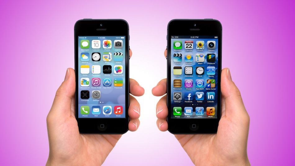
Apple has made one of its biggest update to its operating system. iOS device users cannot help but compare which of the two OS is the right one for their iPhones.
They are stuck with the decision on whether or not to update the current iOS 6 to the recently revealed iOS 7. When iOS 7 was unveiled, there were several harsh remarks about it, specifically the icons of iOS 7.
If you are torn between iOS 6 and iOS 7, you will find this article pretty useful so that you can make the right option for your iOS device.
Lock Screen
Let us start with the Lock Screen; there is one prominent change in the Lock Screen of iOS 7. The design is simpler and the fonts used were definitely much thinner compare to previous iOS.
iPhone users don’t need to slide bars in order to unlock the screen, iOS device users would need to slide from left if they want to unlock the screen. There is a minimalism feel in iOS 7 which makes it a lot cleaner.
Notification Center
In iOS 6, there are notifications for Twitter and Facebook buttons. The focus of Notification Center in iOS 7 is on the calendar, but it still provides the information about the weather just like in iOS 6.
Siri
There are not much changes done with Siri, it is still comparable with iOS 6. However, you can now see audio waves move when you speak.
The design is almost the same except that it possesses a simpler interface in iOS 7 because it no longer displays that question that you have asked to Siri.
There is a huge difference between the mail screen of iOS 6 and iOS 7. Again, the minimalist design of iOS 7 is very obvious in this area because of the thin fonts and icons used. It looks flat and is very light too.
Multitasking
There is a significant change when it comes to the multitasking capability of iOS 6 and iOS 7. iPhone users can see the entire screenshots of the applications that are in use.
There’s a totally different interaction in iOS 7, it seems more complex now than it was before. Even when it comes to quitting the apps that you use is very much different from how you do it before.
Messages
Comparing the messages of iOS 6 and iOS 7, it has changed a lot too. The bubble element that you see in previous iOS is very much different in iOS 7; however the top part looks cluttered.
There are also noticeable changes on the message keyboard, it looks flat and lighter too.
Overall, the iOS 7 has much flatter interface compare to iOS 6.
Apple also decided to change its color scheme, white is the prominent color in iOS 7. The glossy texture of iOS 6 has been changed to attain the flat and minimalist design of iOS 7.
Some iPhone users find the new design more refreshing, while there are those who think the iOS 7 looks dull and boring. It’s up for the users to decide to whether or not update their iPhones iOS 6 to iO7.
Image credit: google images and mashable









Hello! I downloaded the ios7 and it’s really great but did anyone also notice the lags between sliding screens? is it a beta problem or is something wrong with my version? got the beta from here : http://www.ios7down.blogspot.com seems to work ok but i liked the old iOS better!
on which particular iOS device did you have it installed?
Fantastic post Obasi. Thankyou for sharing this info about the iPhone 7:)) Have to admit I’m a Samsung Galaxy girl:D
You are not alone Nicole, I am also an android fan boy who loves playing around every custom android operating system as that makes the digital age sweeter
Thanks a lot for the wonderful post. But I would make Android over iOS any day
Looks like I’ll be sticking around to my same IOS6. It just seems like the more technical we become the more complex technology will be. Thanks for sharing share!
thanks Obasi, great outline of the difference between iOS 6 and iOS7
I am looking forward to IOS7… i like being on the cutting edge.. Great comparisons!